Custom apparel empowers unique expression, adorning gatherings, conventions, and events with personalized designs; understanding optimal placement elevates this creative potential significantly.
The rise of custom t-shirts reflects a desire for individuality, moving away from mass production towards designs that truly represent personal style and identity.
Why Placement Matters
Strategic t-shirt design placement profoundly impacts visual appeal and message delivery. A well-positioned graphic commands attention, enhancing brand recognition or conveying a specific sentiment effectively. Conversely, poor placement can diminish a design’s impact, rendering it awkward or illegible.
Consider the human eye’s natural reading patterns; designs should flow with these tendencies for optimal readability. Placement influences how a design interacts with the body’s contours, affecting its overall aesthetic. Thoughtful placement ensures the design complements the t-shirt’s shape and the wearer’s physique.
Furthermore, placement dictates the perceived value of the garment. A carefully positioned logo projects professionalism and quality, while a haphazardly placed design can appear amateurish. Ultimately, mastering placement transforms a simple t-shirt into a powerful statement of style and intent, reflecting individuality and brand identity.
Understanding Design Scale & T-Shirt Size
Design scale must harmonize with t-shirt size for a visually balanced result. A large design on a small shirt appears overwhelming, while a tiny design on a large shirt gets lost. Proportionality is key; consider the wearer’s size and the intended aesthetic.
Scaling involves adjusting design dimensions relative to the shirt’s width and height. Mockup generators are invaluable tools for visualizing different scales before production. Always account for potential distortion during the printing process, especially with complex graphics.
T-shirt sizing charts vary between brands, so accurate measurements are crucial. A design perfectly placed on a sample size might shift on a different size. Prioritize clear communication with your printing partner regarding both design scale and garment dimensions to ensure a polished, professional final product.

Standard T-Shirt Placement Options
Classic placements offer reliable aesthetics, including center chest, left chest, full front, back neck, centered back, and full back designs, providing versatile options.
Center Chest Placement
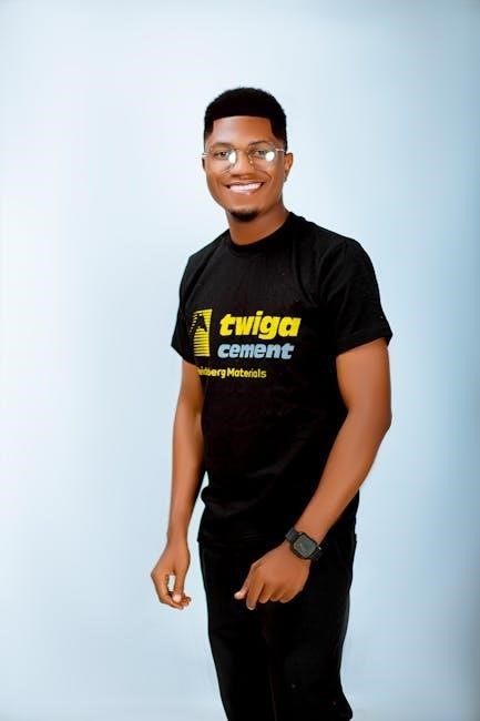
Center chest placement is arguably the most traditional and widely recognized location for t-shirt designs, offering a balanced and impactful visual presentation. This placement works exceptionally well for logos, bold graphics, and impactful text-based designs, creating a focal point that immediately draws the eye.
Consider the size of the design in relation to the shirt size; a design that appears proportionate on a medium shirt might overwhelm a small or look lost on an extra-large. Generally, maintaining a design width of approximately 8-10 inches is a good starting point for adult sizes, adjusting proportionally for youth or larger garments.
Ensure sufficient spacing between the design and the neckline to avoid any visual crowding or potential distortion during wear. This placement is ideal for branding, event shirts, and designs intended to make a strong, immediate statement. It’s a safe and effective choice for a broad range of styles and audiences.
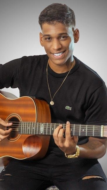
Left Chest Placement (Pocket Area)
Left chest placement, often above the pocket, offers a subtle yet sophisticated look, ideal for logos, small graphics, or minimalist text. This placement exudes a classic, understated style, frequently seen on workwear, polo shirts, and designs aiming for a refined aesthetic. It’s a great option when you want branding or a design element present without being overly dominant.
Design size is crucial here; keep it relatively small – typically 3-4 inches in width – to maintain proportionality and avoid looking bulky. Consider the pocket itself; designs can be placed directly above, slightly offset, or even integrated with the pocket’s shape for a unique effect.
This placement is particularly effective for brand recognition, allowing for consistent logo display without being intrusive. It’s a popular choice for corporate apparel, team uniforms, and designs that prioritize a clean, professional appearance.
Full Front Placement
Full front placement maximizes design visibility, making it a bold and impactful choice for statements, large graphics, or intricate artwork. This approach utilizes the entire central area of the t-shirt, creating a dominant visual presence that immediately captures attention. It’s perfect for designs that demand to be seen and appreciated in their entirety.
Scale is paramount with full front designs; ensure the artwork is appropriately sized for the shirt’s dimensions to avoid distortion or a cramped appearance. Consider the overall composition and balance to create a visually appealing and harmonious design.

This placement is ideal for artistic expressions, band merchandise, or designs with a strong narrative. It allows for detailed imagery and complex layouts, offering a canvas for creativity and self-expression. However, be mindful of potential printing limitations and fabric stretch.
Back Neck Placement
Back neck placement offers a subtle yet effective branding or design element, ideal for smaller graphics, text, or logos. This location provides a discreet touch of personalization without overwhelming the overall aesthetic of the t-shirt. It’s a popular choice for adding a unique identifier or a hidden message.
Consider the wearer’s hairstyle when designing for this area; longer hair may obscure the design, while shorter styles will showcase it more prominently. Keep the design concise and legible, as the space is limited. Simplicity is key for maximum impact.
This placement is frequently used for care instructions, size tags, or brand names, offering a functional and stylish solution. It’s also a great spot for a small inspirational quote or a personal motto, adding a touch of individuality.
Centered Back Placement
Centered back placement is a classic choice for larger, bolder designs, making a strong visual statement. This area provides ample space for detailed graphics, impactful text, or prominent logos, ensuring maximum visibility. It’s particularly effective for designs intended to be seen from a distance, like at events or concerts.
Consider the t-shirt’s length and the wearer’s typical posture when determining the design’s size and position. Avoid placing designs too low, as they may be obscured by the wearer’s back. Symmetry is often preferred for this placement, creating a balanced and polished look.
This location is ideal for showcasing band logos, event artwork, or large-scale illustrations. It allows for creative freedom and provides a canvas for expressing a strong message or visual identity.
Full Back Placement
Full back placement offers the largest canvas for your designs, enabling expansive artwork and intricate details. This technique is best suited for bold statements, all-over prints, or designs that demand maximum impact. It’s a powerful option for creating a truly unique and eye-catching t-shirt.
When utilizing full back placement, consider the design’s flow and how it will interact with the t-shirt’s shape. Ensure the artwork is appropriately scaled to avoid distortion or awkward cropping. Sublimation printing is often favored for full back designs, allowing for vibrant, all-over coverage.
This placement excels with large-scale illustrations, photographic prints, or complex patterns. It’s a fantastic choice for artists and designers seeking to showcase their work on a wearable medium, offering unparalleled creative freedom.
Advanced T-Shirt Placement Techniques
Beyond standard locations, explore asymmetry, sleeve designs, and wrap-around concepts for innovative looks; sublimation unlocks all-over print possibilities, demanding careful consideration.
Off-Center Designs & Asymmetry
Breaking from traditional symmetry can inject a dynamic and modern feel into your t-shirt designs. Off-center placements immediately draw the eye, creating visual interest and a more contemporary aesthetic. This technique works exceptionally well with graphic designs or text that doesn’t necessarily require strict balance.
Consider the wearer’s body shape when implementing asymmetry. A design slightly shifted to one side can complement the natural lines of the body, enhancing the overall look. Experiment with varying degrees of offset – a subtle shift can be just as effective as a more dramatic one.
Asymmetry isn’t simply about random placement; it requires thoughtful composition. Ensure the design still feels balanced, even if it’s not symmetrical. Utilize negative space effectively to guide the viewer’s eye and create a harmonious visual experience. This approach allows for unique and memorable t-shirt creations.
Sleeve Placement (Left & Right)
Sleeve placement offers a subtle yet impactful avenue for t-shirt design, often overlooked in favor of more prominent areas. Utilizing the sleeves allows for a unique branding opportunity or a complementary design element to a larger front or back graphic. Consider smaller logos, minimalist patterns, or short phrases for optimal impact.
Placement consistency is key when designing for both sleeves. Ensure designs are mirrored or intentionally different but balanced in their visual weight. Pay attention to the sleeve’s curvature and how the design will wrap around it, avoiding distortion or awkward cropping.
Sleeve designs are best suited for adding detail rather than being the primary focus. They work well as accents, reinforcing brand identity or adding a touch of personality. Remember to consider the t-shirt’s sleeve length and style when determining the appropriate design size and placement.
Wrap-Around Designs
Wrap-around designs create a dynamic and immersive visual experience, extending a graphic seamlessly from the front to the back of the t-shirt. This technique is particularly effective for bold, continuous illustrations or impactful statements that benefit from increased visibility. Careful planning is crucial to ensure a cohesive and visually appealing result.
Consider the design’s flow and how it will transition across the body. Avoid abrupt breaks or misalignments that can detract from the overall effect. Utilizing a mockup is essential to visualize the wrap-around design accurately before production. Pay close attention to the placement around the side seams.
Wrap-around designs often work best with all-over print sublimation techniques, allowing for full coverage and vibrant colors. However, they can also be achieved with traditional screen printing, requiring precise registration and potentially multiple print runs.
All-Over Print (Sublimation) Considerations
All-over print, typically achieved through sublimation, offers unparalleled design freedom, covering the entire t-shirt surface. However, it demands specific considerations. Unlike screen printing, sublimation requires polyester or poly-blend fabrics to ensure the ink bonds effectively with the material. 100% cotton won’t work!
Design resolution is paramount; high-resolution images are essential to prevent pixelation or blurring across the entire garment. Seamless patterns and edge-to-edge designs are ideal for this technique, maximizing the visual impact. Mockups are vital for previewing the final product.
Color vibrancy is a key advantage of sublimation, but be mindful of color profiles to ensure accurate reproduction; Also, consider potential variations in print quality across seams and folds during the heat transfer process. Careful fabric selection and design preparation are crucial for optimal results.

Placement Guidelines for Different Design Types
Strategic placement enhances design impact, varying with the design’s nature. Text benefits from clear visibility, while graphics thrive with impactful positioning for maximum aesthetic appeal.
Text-Based Designs & Readability
Prioritizing readability is crucial for text-based t-shirt designs. Center chest placement often works well for concise phrases, ensuring immediate visibility and a balanced aesthetic. However, consider the length of the text; longer quotes or sentences may necessitate a full-front placement to avoid appearing cramped or distorted.
Font choice significantly impacts readability. Opt for clear, legible fonts, avoiding overly stylized or intricate designs that can become difficult to decipher when printed on fabric. Ensure sufficient contrast between the text color and the t-shirt color for optimal visibility.
Left chest placement (pocket area) can be effective for smaller text elements like initials or short slogans, offering a subtle yet stylish look. Always preview a mockup to assess how the text appears at the intended size and placement before finalizing the design. Consider the wearer’s perspective and ensure the text is easily readable from a normal viewing distance.
Graphic Designs & Visual Impact
Graphic designs demand strategic placement to maximize visual impact. Full-front or centered-back placements are ideal for large, detailed graphics, allowing the artwork to take center stage. Consider the graphic’s composition and ensure key elements aren’t obscured or awkwardly positioned on the body.
Off-center designs can create a dynamic and modern aesthetic, but require careful consideration to maintain balance and avoid a cluttered appearance. Asymmetry can draw the eye and add visual interest, but ensure the design feels intentional and not haphazard.
Smaller graphics often benefit from left chest placement or sleeve placement, offering a subtle yet stylish accent. Always assess how the graphic’s colors and details will translate onto the chosen fabric. Previewing mockups is essential to confirm the design’s overall impact and ensure it aligns with the intended aesthetic.
Logo Placement for Branding
Strategic logo placement is crucial for brand recognition and impact. Left chest placement (pocket area) is a classic choice, conveying a sense of professionalism and subtlety, ideal for corporate or team apparel. Center chest placement offers greater visibility, suitable for showcasing a primary brand logo.
Consider the logo’s size and shape relative to the t-shirt. A larger logo might demand a full-front placement, while a smaller logo can be effectively positioned on the sleeve or back neck. Consistency is key; maintain uniform logo placement across all branded apparel.
Ensure the logo’s colors complement the t-shirt’s fabric. Previewing mockups is vital to confirm readability and visual appeal. Effective logo placement reinforces brand identity and creates a lasting impression on viewers, solidifying brand awareness.
Tools & Resources for Accurate Placement
Utilize mockup generators and design software featuring placement guides to visualize designs on t-shirts before production, ensuring precision and a professional finish.
Mockup Generators & Templates
Mockup generators are invaluable tools for visualizing your t-shirt designs on realistic garment models before committing to printing. These platforms allow you to upload your artwork and experiment with different placements, sizes, and colors, providing a clear preview of the final product.
Numerous online resources offer free and premium t-shirt mockup templates. These templates often come in various file formats (PSD, PNG, etc.) and can be easily customized using design software like Adobe Photoshop or GIMP. They simulate different t-shirt styles – crew necks, V-necks, hoodies – and offer diverse perspectives, including front, back, and side views.
Benefits include saving time and money by identifying potential placement issues early in the design process. They also facilitate client presentations, allowing you to showcase design concepts professionally. Look for generators that offer realistic fabric textures and lighting effects for the most accurate representation.
Design Software with Placement Guides
Professional design software packages, such as Adobe Illustrator and CorelDRAW, often incorporate features specifically designed to aid t-shirt placement. These include customizable guides, grids, and rulers that allow for precise alignment and scaling of artwork.
Many programs offer dedicated t-shirt mockup templates directly within the software, streamlining the visualization process. These templates typically include pre-defined safe areas, indicating the printable regions of the garment and helping to avoid design elements being cut off during production.
Utilizing layers and non-destructive editing techniques is crucial for flexibility. This allows you to easily adjust design placement without permanently altering the original artwork. Exploring software tutorials and online resources can unlock advanced placement features and ensure optimal design results.

Common Placement Mistakes to Avoid
Ignoring the garment’s seams and folds is a frequent error, leading to distorted designs. Always account for how the fabric will drape and move when worn, ensuring artwork remains visually appealing. Placing designs too close to the collar or armholes risks cropping or distortion during printing and wear.
Incorrect scaling relative to shirt size is another common pitfall. A design that looks perfect on a sample mockup might appear disproportionate on larger or smaller sizes. Overlooking the print area limitations of the chosen printing method (like screen printing) can result in rejected artwork.
Failing to consider the wearer’s body shape can also impact design effectiveness. Always preview designs on mockups representing various body types to ensure a flattering and comfortable fit. Careful planning prevents costly reprints and dissatisfied customers.